Forgiven Much Ministries, dedicated to training leaders to run support groups dealing with sexual addictions, approached me in 2013 for a rebranding. Until that time, they had done what a lot of startups and non-profits do - they did all their own graphics. And unforttunately, since that is not their area of expertise, it showed.
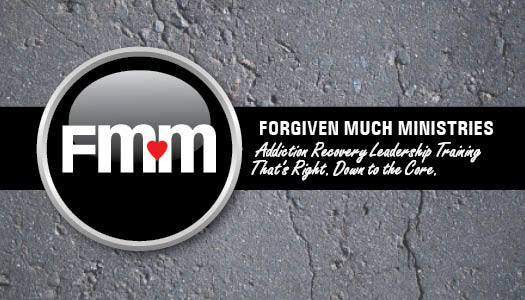
After determining FMM's audience and what their needs and wants are, this mark became the embodiment of all of that. Usually shown on a hard surface like asphalt, to represent the difficulty in dealing with these kinds of matters and the people who have this issue, this button logo is a symbol of hope, a button to push, to get to the heart of the matter.
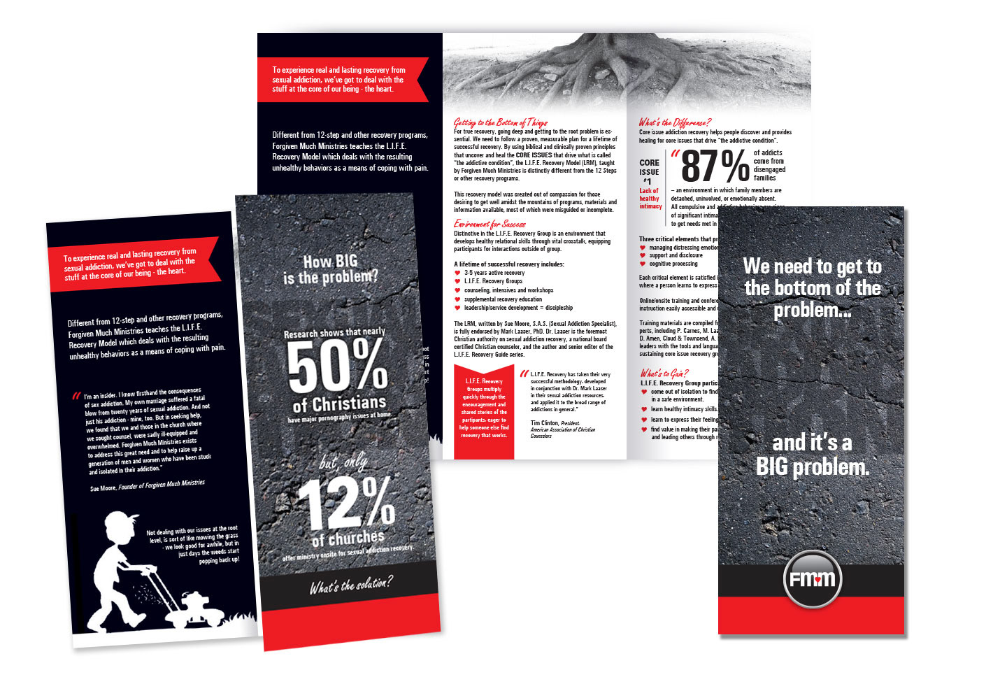
After creating the mark and getting the "look" of the business cards underway, the next project to tackle was the handout brochure. FMM ends up at a lot of conventions and trade shows, informing people of the magnitude of the problem and what they have to offer in the form of permanent solutions.
The cover for the brochure required a headline to get attention. In the background, almost hidden, is the term "Sexual Addiction" to represent the reality of it being a problem sort of in the shadows, even though, statistically, it challenges a large part of our population.
The black and white palette is used for its strong contrast with red accents to invoke a sense of alarm.
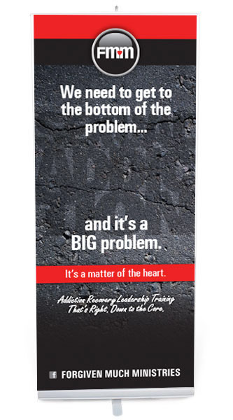
The front of the brochure easily translated into a single popup banner, used for their many trade shows.

Shown here is the ministry founder, with her new professional look. Many people who have known her for years have complimented her on how professional her materials look now. How credible it makes the ministry look. (on the tablecloth is the old logo)