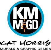

SLTC branding - program catalog: this was the first piece of branded collateral for SLTC after completing a branding exercise. The exercise gave me information I needed in order to find the brand's voice, and create a (now trademarked) slogan, "Put it all on the line", as well as the look. The goal of the rebranding was to expand their already stellar reputation further into their marketplace, to both students and potential employers for those students - to give them a presence. Within one year, registration for training became so intense, classes were not only filled, but students were willing to wait up to a year to get in. They were identifying with the look and feel represented by the new brand. So much, that other smaller schools and even "the big guys" began to emulate the new brand.
The cover image here, directed by KMMGD, embodies the attitude of the intense marine-like training - personal pride, grit, and the confidence of knowing you're part of the elite in your field - that not everyone qualifies to be there. It completely separated SLTC from the one other large school in their category.
The catalog can be seen in its entirely in the Catalogs Gallery.
SLTC branding: Everything about the new brand was in your face, down and dirty, and bigger than life. The catalog is loaded with textures and large images of the tools of the trade. It was also filled with inspirational quotes about determination and leadership in keeping with the school's motto: Knowledge, Discipline and Ability.
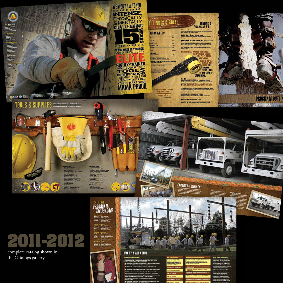
SLTC branding - graduation programs and graduation tickets: There are three sessions at SLTC, one always completed right before Christmas. By this third session, two and a half years into the branding, the graduation ceremony had become so full, that tickets had to be issued in order to accommodate the crowds of supporting parents and other family members of the nearly 180 graduates now.
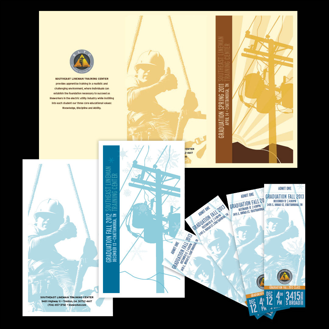
SLTC branding - before pic of catalog, no. 10 envelope and graduation program. You can see why they needed some help! And what a brand transformation!

SLTC branding - stationery package: Catalog envelope, letterhead, No. 10 envelope and business cards all got a facelift.

SLTC branding - website design: The next huge change in the SLTC branding a complete overhaul of the website. During the process of organizing materials for the navigation of the site, I found that all of the aspects of the school fit well under three main categories: The School, The Program, and The Career. From there on out, everything has been put under those headings.
An email campaign was generated from a form found right there on the home page, for the purpose of informing potential students what life as a lineman would really be like, to both eliminate those not likely to succeed in the training environment and to challenge those who would.
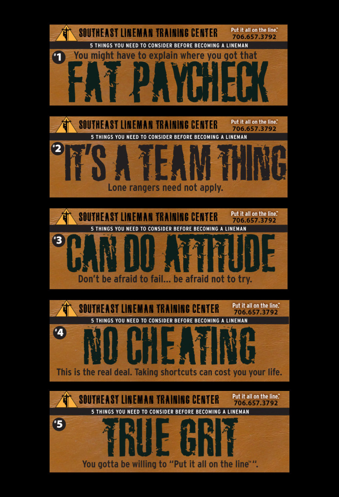
SLTC branding - Infusionsoft (similar to MailChimp) Email headers: 5 weekly emails sent to the home page visitors who filled out the form wanting to know "5 Things You Need to Know Before Becoming a Lineman". The content of each email dealt with 5 core things that would be required to succeed in the program.
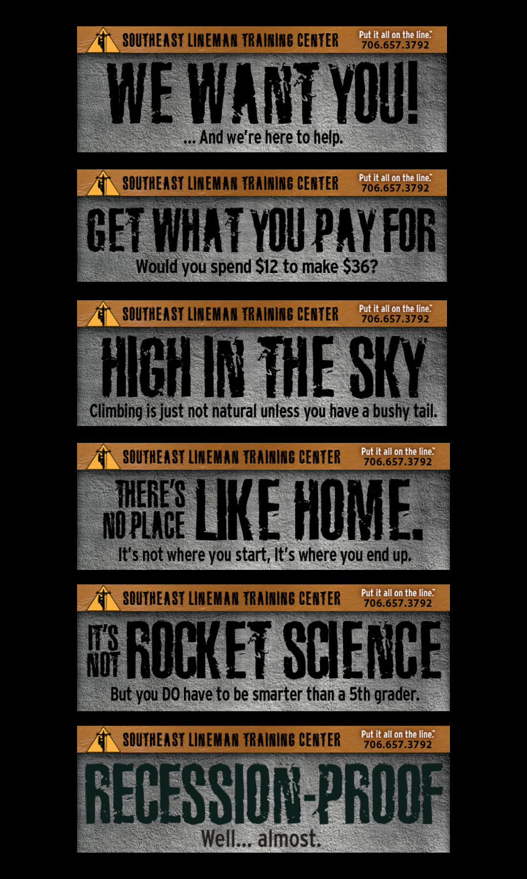
SLTC branding - Infusionsoft (similar to MailChimp) Email headers: entitled "The Nurture Sequence", these emails were sent to those inquiring about the program, dealing with common questions and fears: 1.) Can I make it through the acceptance process? 2.) Can I afford it? 3.) What if I have a fear of heights? 4.) Will I be able to get a job in my own hometown? 5.) Am I smart enough? 6.) Will I find work once I have my training?

SLTC branding - Website Design: Sample Pages from the 2012 website. See full website in the Website Design Gallery.
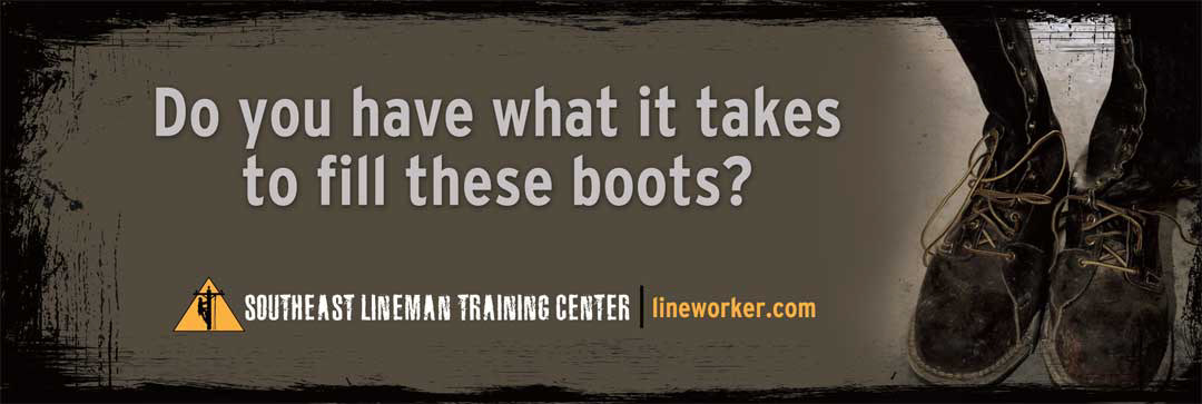
SLTC branding - Billboard: This branded billboard can be seen on the road on main route to the campus entrance.

SLTC branding - Trade show graphics: 10' popup with mural panels; 3' retractable banner with infographics from SLTC sales sheet.

SLTC branding - Housing Brochure: Housing for the 15-week program is available at various locations near the campus. Before this brochure was made, individual (and somewhat primitive) maps were given to parents to check out potential housing. This new brochure, with the new branded look, looked credible, and professional, easing the mind of parents and students alike.

SLTC branding: The new branding included KMMGD painting 2 murals in the hallway leading from the classroom area to the pole circles. The Thumbs Up Lineman is frequently a place where students get their picture made and was the backdrop for the parts of the Woodwalker video series.

SLTC branding - Branded Christmas Card: I was asked to come up with something unique for the annual Christmas card, for the first year of their new branding campaign. It was largely sent out to vendors and utility companies, solidifying the reputation of the school and garnering new respect as the rebranding continued to roll out into different pieces of collateral.

SLTC branding - Acceptance Package: SLTC had been using the traditional acceptance letter and folder with other documentation to send to students who accepted into their program. We completely turned that on its head by designing the acceptance letter as an 11x17 poster the newly approved student could proudly hang up and display. The other info got put either onto the thumb drive or the WHAT'S NEXT card, all rolled up with an SLTC long-sleeved t-shirt into a mailing tube that looked like a pole!
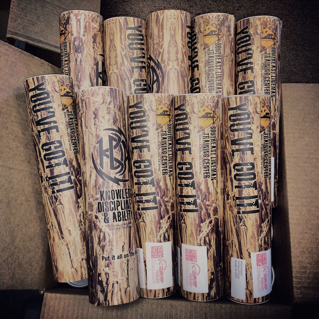
SLTC branding - Branded Mailing tube. On the address side of the tube reads the words "You've Got it!". On the other side of the tube, which was likely to be displayed to friends and family (no mailing indicia), is the introduction to the school's motto: Knowledge, Discipline and Ability with the KMMGD-designed KDA tattoo logo.

SLTC branding - Official SLTC branded t-shirt: The KMMGD slogan created for the 2011-2012 catalog, "At the end of the day...." became part of the official school t-shirt. Seen also is one of the pole circle hardhat decals earned upon completion of a certain part of the pole training. Each of the pole circles has their own identity on t-shirts, hoodies, a pole circle flag, and decals the size of this one.
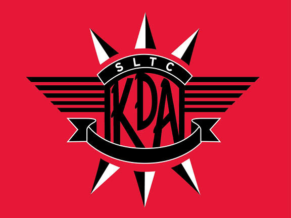
SLTC branding - Pole Circle 1 Identify - KDA. The KDA phrase was coined by one of SLTC's former instructors, so it became the first officially marked pole circles. Eventually, each pole circle, almost like a fraternity, came up with a unique color and logo that each student, who makes it to the end, proudly wears as a badge of honor.

SLTC branding - Pole Circle Identity Flags: Much of the field training that takes place at SLTC is in the pole circles. The students spend most of their time with an instructor assigned to that particular pole circle and they learn to work as a unit. We felt that individual logos or identification for each group would be a plus, and help them to develop the pride and dedication within their own team better as a result. We were right.
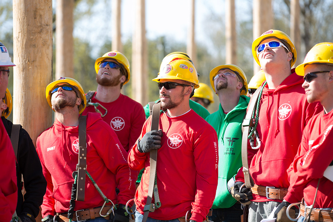
SLTC Branding - Pole Circle Identity: Hardhat Decals and clothing. Also, to the far left, you can see the decal shown below "Major League Woodwalker". Hardhat stickers become much like motorcycle helmet stickers to these guys.

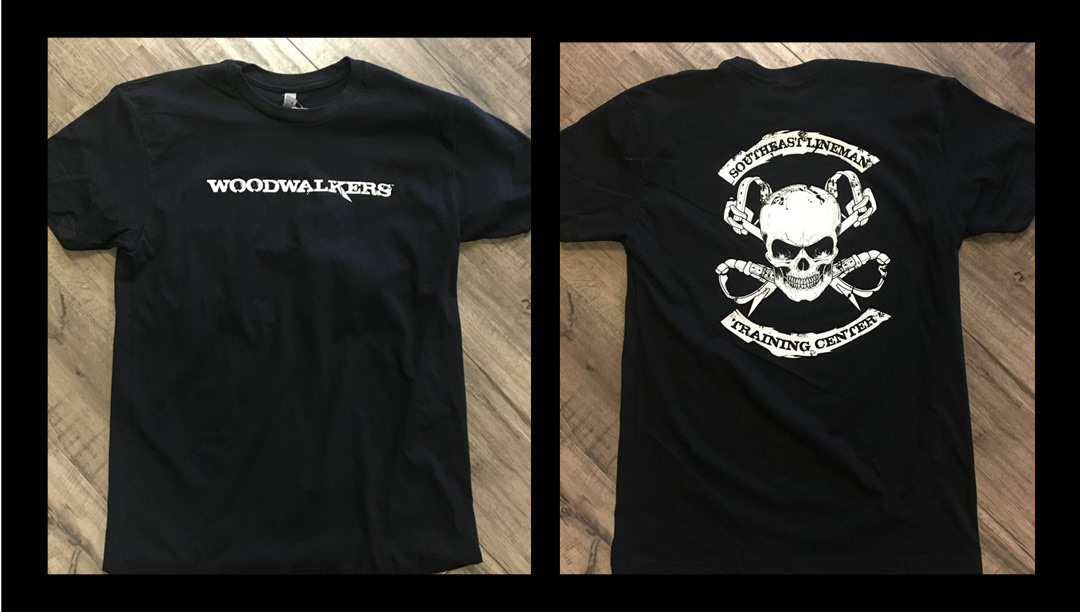
SLTC branding - Woodwalker campaign logo. The nickname "Woodwalker" was coined by one of the Vice Presidents of SLTC, shown several pics below. The red, white and blue logo was developed first, before the name was trademarked and branded.

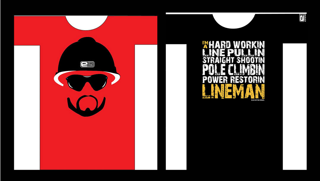
SLTC branding: Major League Woodwalker gear - available for purchase at elevatedgear.com

SLTC branding - Elevated Gear Logo: The Woodwalker™ gear, along with other t-shirt designs started becoming major selling items at SLTC graduations, to the point where a separate brand was developed to offer these things and other high quality outdoor gear aimed at adrenaline junkies.

SLTC Branding - Elevated Gear: metallic signage and Elevated Gear ballcap.

SLTC branding - Woodwalker logo: SLTC trademarked the name and branded it under their parent company. The letter "K" is designed like the gaff on the lineman boot climbers.
SLTC branding - Woodwalker t-shirt designs.

SLTC branding - Woodwalker t-shirt designs.
SLTC branding - Proposed t-shirt designs for lineman under the Elevated Gear brand.

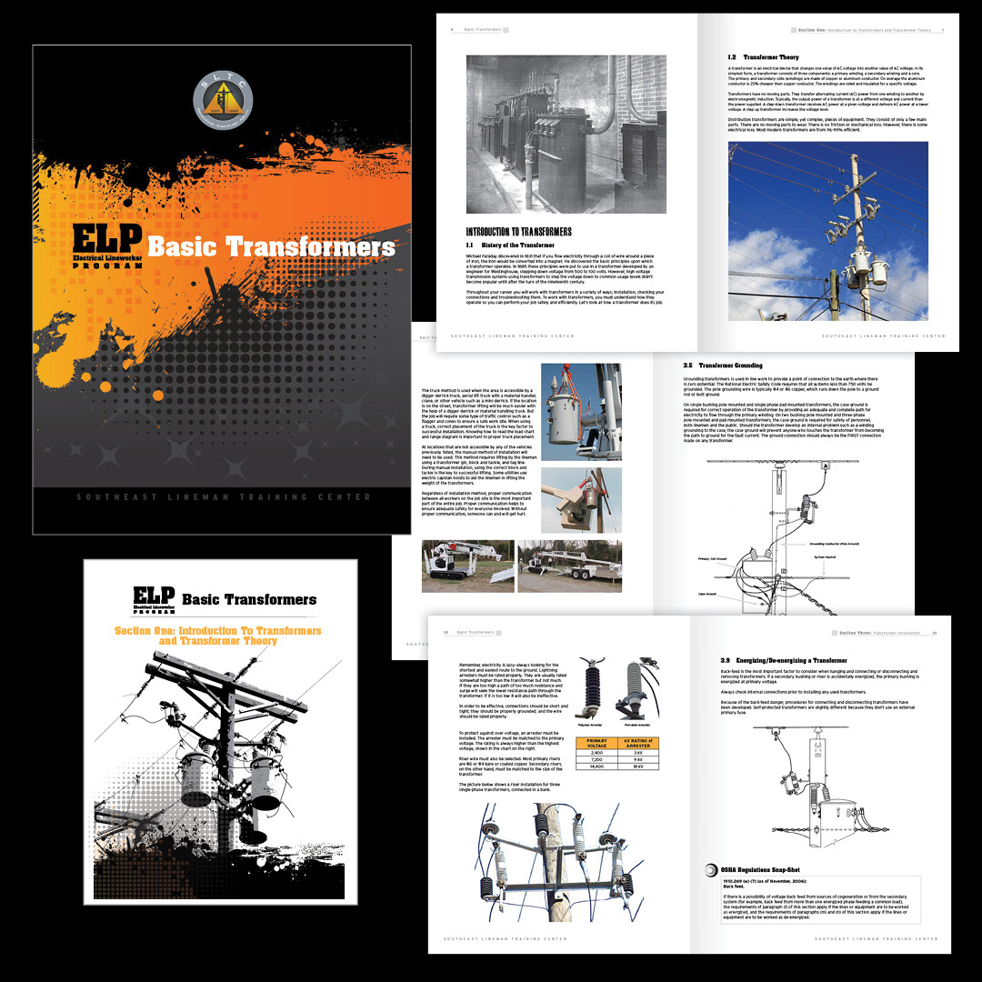
SLTC branding - Program Manuals and book covers: Eventually all of the SLTC manuals had to be branded. There are 6 manuals within the Electrical Lineworker Program. SLTC also offers specialized training, which - in some cases- precluded special manuals edited for that specific group's training needs.

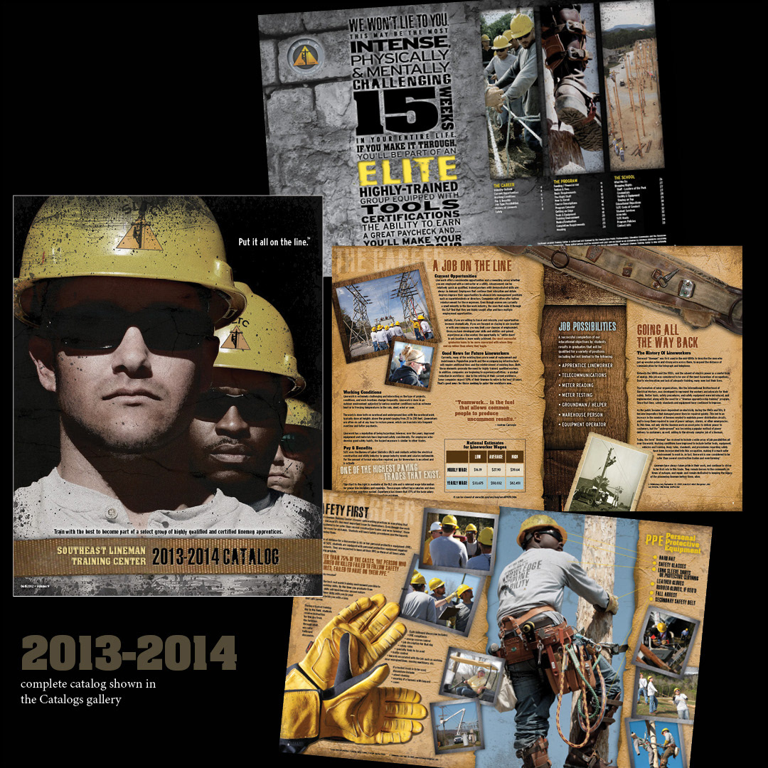
SLTC branding - Program Catalog: We decided that the image on the front cover was still powerful enough to use for the new program catalog. New textures, backgrounds, and updated photos were added to the contents, as they were reorganized into the three categories The School, The Program, and The Career. This catalog won an ADDY award (like the Oscars for advertising)

SLTC branding - Program Catalog: By the time this 2015-2016 catalog rolled around, SLTC was now the leader of the pack. They had videographers and photographers on staff, adding to the quality of the offerings in both categories. To give the catalog a completely new look, I changed the orientation, changed out the textures and fonts, added hand-drawn elements, some pointing to the new elevated gear brand, while keeping some of the familiar elements and brand voice.